Welcome, Members of Parliament

Welcome, Members of Parliament. This blog is designed to act as a student forum for anyone enrolled in my classes at a Dallas-area proprietary college, former students, and/or others who find our conversations interesting. The Parliament will be moderated to ensure civility and relevance. The directions we take, the paths we follow, and the concerns we address are all up to you.
Showing posts with label art and design. Show all posts

Thursday, July 21, 2011

Design and Stuff

For my first Summer quarter post, I was inspired by an article in Good about whether or not it's possible for designers to save the world without creating more stuff. Material objects are, after all, the focus of our design programs at AiDallas. What would to design mean if we weren't focused on creating objects?

One of the major revelations to come out of my first week of classes (and I don't know why this hadn't occurred to me before) was that in the ancient world, people made things carefully because they couldn't just go down to their local Buy More and get a replacement when something broke. There probably wasn't much garbage to pick up, because early economies weren't based on disposable objects. Everything was designed with its purpose in mind, and the designs (as we learn from Uhlmeyer's Rule of Technological Development #312) endured when technologies changed. That's why the early ceramic jugs in neolithic Turkey looked just like the baskets they had replaced as water carriers.

In our art & design history discussions during these first two weeks of classes, we've talked about the notion of "art for art's sake"--the nineteenth-century idea that "fine" art was qualitatively better than "applied" art because it was made for no purpose other than its beauty. But the Greeks and Romans made beautiful things that all had uses: funerary or heroic statues, painted pottery for drinking wine, temples for worshiping gods, etc. The words they used for art (techne and ars) both contained the idea that the objects be well-crafted, skillfully wrought.

Archaeologists love ancient dumps (middens) because they contain clues about the people who occupied the sites under study. But those dumps rarely contain objects discarded whole--only broken bits of things. Acoma Pueblo native Americans actually gather old potsherds to add to new pots made using traditional techniques, wasting nothing. In fact, the reason Indiana Jones isn't a believable archaeologist is that he just takes whole objects out of context--something no reputable scientist would ever do. The real guys in the safari hats get their kicks out of finding bits and pieces that can be put back together to give us an idea about what they originally looked like and what they were used for. Just about the only time we find collections of intact artifacts is when they've been buried by some disaster, like the eruptions of Mt. Vesuvius or Thera.

I hadn't realized before this week that the archaeology exercise my humanities students do (figuring out what random objects in a box might "mean") is more realistic than I'd imagined, because the stuff in the boxes is all twenty-first century junk: miscellaneous bits of useless crap randomly put together, just like what future archaeologists are going to find in our landfills. Cheesy little toys from Happy Meals, broken crayons, miscellaneous buttons, and junky jewelry are going to tell our story more potently than a museum full of art works.

In the opening photograph, all of the items pictured could be recycled; instead some idiot (or idiots) left them in a pine forest somewhere. The plastics will be there just about forever--and somebody designed every one of these objects.

So here's the question: how do fashion, interior, web, graphic, and other designers create without just adding more junk to the growing mounds of waste on this planet?

Image credit: Photo by Michelangelo-36, via Wikimedia Commons.

Tuesday, June 7, 2011

Spring Quarter Miscellany

Due to major lack of interest on my students' part, as well as lack of time on my own, I've neglected the Parliament for the entire quarter. Sudden needs for bonus points have emerged, however, and so to accommodate those who've been suddenly inspired to enhance their final grades, I'm offering up a couple of newsy bits that might be useful to some of you.

An old friend of my art and design history and humanities courses, Maggie Macnab (Macnab Design) recently presented a TEDx talk in Albuquerque, called "The Nature of Symbols." This should be interesting to anyone involved in design, advertising, branding, and any number of artistic pursuits.


I've frequently recommended Macnab's book, Decoding Design, to instructors and students alike, and her newest effort, Design By Nature, will be published later this year.

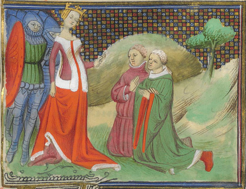
Here's one that goes to show you that taking art history classes might not be a complete waste of time. The Morgan Library & Museum in New York has launched an exhibit called Illuminating Fashion: Dress in the Art of Medieval France and the Netherlands, and the New York Times review of the show includes a nifty slide show with images from the featured manuscripts. Karen Rosenberg, who wrote the review notes that it "will teach you to scrutinize centuries-old manuscripts as you would a style magazine." For fashion history students, this approach seems made in heaven; not only can you find out what people wore when, but you might also be struck with inspiration for new and unusual designs based on centuries-old models. Aspiring rock singers could out-gaga Lady Gaga with information like this!

For further inspiration, try perusing the manuscript illumination images on Wikimedia Commons, where I found the image of Queen Isabelle of France at left. It's a 15th century painting by a guy known as "the Boethius Master" for the Froissart Chronicles.

This will undoubtedly be my last (as well as first) post for the quarter, so I hope everyone has a splendid summer vacation. I think we all deserve a bit of time off after having slogged through 22 weeks with only a seven-day break in the middle, and a couple of holidays that may have done more harm than good. Be careful out there!

Wednesday, February 9, 2011

Design Web News

Yet another snow day has found me on the web, and fooling around with blog design. The initial "Watermark" template was only meant to be temporary, but I haven't until today had time to sit down and work on changing it. I'd appreciate some feedback, since this will always be a work in progress. If you think it needs more tweaking, let me know, and we can work on it together.

While I was messing about in my e-mail this morning, I found some stuff you folks might find interesting. The first item came to me via Good magazine, which featured an article on a blog called 10Answers, founded by Rebecca Silver who writes and designs in (where else?) New York City. The concept is simple. Every post consists of a series of ten questions Silver asks of fellow creative people, such as yesterday's interview with graffiti artist/muralist Caleb Neelon. Categories include almost every kind of art and/or design, so there's something here for everyone. I'm thinking of adapting her format for my student information sheets--since the answers are much more interesting than what I usually ask for.

From the venerable New York Times section on the Arts came a short article on an exhibit at Milan's La Triennale Design Museum, Celebrating a Graphic World. Oddly enough, there are more images available on my iPad version of the Times online--but the primary interest of the article lies in its discussion of changes in how we view the field of graphic design and its relationship to advertising.

And just in case you haven't heard about this yet, Google's latest wizardry involves applying its street-view technology to museums. Go to the Google Art Project to visit some important museums around the world, and use its features to explore significant works of art really close-up. Ever wanted to put your nose right up to Van Gogh's Starry Night? You can do it here--just go to the Museum of Modern Art (MoMA) in New York, and zoom in.

As usual, I leaped over to Wikimedia Commons when I was looking for an image to illustrate this post. I wanted to see if there was anything available that had at least something to do with graphic design (since all of the stuff related the articles I mentioned is copyrighted). With my usual serendipitous luck, I found a work by the British poster artist, Tom Eckersley which reminded me of the snow outside my window, of the Pont du Garde aqueduct in Nimes, France (featured in this week's History of Art & Design I lecture), and Henri Matisse's cut paper works. You can see an online collection from his long career at the Visual Arts Data Service.

And if all the above isn't enough to keep you from getting bored (if, of course you're already finished with whatever I've assigned for the week), take a look at this site full of Free Images from generous folk who, like those who contribute to Wikimedia Commons, don't mind not making a buck off of everything they do.

Monday, November 22, 2010

More Nincompoopery about Nekkid Bodies

Oh, puh-leese! Not again.

Last week the Daily Poop (aka the Dallas Morning News) ran a story about parents' objections to a textbook used in Plano's high school humanities class for gifted and talented students. The book in question is Culture and Values: A Survey of the Humanities. The reason? According to the article's author, the parents who protested the book's use claimed that "the college-level textbook reveals the darkest of artistic expressions" and objected to their daughter's being forced to look at the naughty images--of Michelangelo's David, the Hermes of Praxiteles, Botticelli's Birth of Venus, and Goya's Third of May 1808.

Now, I would agree that the Goya depicts one of the darker moments of human history, but am pretty sure that fourteen-year-olds have seen much worse on the news. If, of course, they watch the news--and if their mommies let them.

But we've heard this song before. In 2006, a Frisco teacher was fired for taking her charges to the Dallas Museum of Art, where one of them apparently caught a glimpse of some naughty bits down the hall and blabbed to mommy. These were fifth-graders, all of whom had obtained permission slips from their parents.

To Plano ISD's credit, they've rescinded their withdrawal of the book, although the parents are pursuing a review through the State Board of Education. Given that board's history, who knows what'll happen (for my take on the Board, see these posts on The Owl of Athena: Back to the Future and Educational Secession). I cannot help, however, but to see the whole episode as yet one more example of how education in Texas is being compromised by short-sightedness and ignorance.

There's apparently a Facebook page on this issue (authored by Ashley Meyers, who graduated from a Plano high school and now attends Northwestern University). Since I'm not a participant in this particular social network, you might want to look up the page and let us know what the 500 followers are saying.

Thursday, September 9, 2010

Art, Science, Storytelling, and Life


I'm adding another TED lecture to your repertoire this week, namely one by Scott McCloud of Understanding Comics fame. Almost all of you should have encountered him by now, if not in your intro to design classes, or storyboarding, then in Writing II (or is it I?).

At any rate, I came upon it by accident when I was looking for TED lectures that might reference the Renaissance (one of the tags on the video, but not really referring to the actual period in art history). This turned out to be one of those wonderful moments of serendipity the web makes possible, because it's relevant to our class in several ways, even though it doesn't really have anything to do with the Renaissance.

One of the first things he does in his talk is to map out three kinds of vision: blind faith (things you believe in but can't see); stuff that's physically visible and thus manifest precisely because we can see it; and what's possible: what we can en-vision. These distinctions are useful, because they can help us talk about art through the ages, and begin to understand how people perceived art in different contexts.

Better yet are his principles for using vision: learn from everyone; follow no one; watch for pattern (where visions of the future begin to manifest themselves); work like hell.

Essentially what this leads to is a path toward innovation--making the new connections that make new stuff happen. In other words, it leads to creativity.

Later, in his discussion of the relationship between art and science, he notes a connection between vision and meaning that points directly to my lecture on the origins of writing: the rebus. Remember the rebus I showed you when we were talking about the origins of alphabets?


Well, this is a good example of the visual made audible--and the achievement of sound through vision. When you think about it, hieroglyphic writing systems depend on this marriage of the aural and the visual in order to make the transition that actually divorces sound from object.

One more thing: if you ever want confirmation that I'm not completely off my noodle about those infamous "rules of technological development," McCloud affirms at least one of them when he reminds us of the error Marshall McLuhan warned about: putting the content of new technology in the shape of the old. Or, according to Uhlmeyer's rule #312, "New technologies often follow the form of the old."

This video is longer than the previous one (about 17 minutes), so grab a snack and sit down for a few minutes. It's a bit dated (filmed in 2005), but quite enlightening nonetheless. Feel free to comment on interesting points you notice, or connections you make as a result of having watched.

Sunday, July 18, 2010

History is important; art is even more important.

The title of this post comes from one of my students; it was the best reply I got of the many written on the backs of the yellow index cards I distributed last week. I asked people to think about why it might be a good idea to take an art history class, and most of the responses were thoughtful if not entirely unpredictable. I was a bit surprised that so many were interested in understanding the continuity from past to present, and projecting it into the future. Although several quipped that they were coerced into taking the class (it's required in most programs), most seem to think that it wasn't a bad idea to know something about the history of their craft.


The comments were also rather refreshingly hopeful, and a large number of them saw knowledge of art history as being important to them professionally: gaining a useful vocabulary, knowing what's already been done, being inspired by the works of great artists.

Another student remarked that "It's hard to make a future when you have no knowledge of the past." Now, this kind of insight is exactly what makes my little Borg-enhanced heart go pitty-pat. Many folks my age have noticed an almost terrifying a-historical bent among today's young people, so finding out that we're (at least in part) wrong actually makes us feel better about the future.

After going through a slide show that demonstrated several practical uses for art history, we went on during that first class to discuss the nature of art and its relationship to design. In all three sections of History of Art & Design I I got the sense that everyone really did see a point in the exercise--that learning about history can, in fact, be helpful to artists and designers in the present.

Time will tell, but I'm pretty optimistic about this quarter. I hope at least some of you will contribute to this blog and keep the conversation lively. Here's to ten more good weeks!