One way to start off a new year and a new quarter is to provide a gift. In this case, it comes from the Smithsonian Institutions, a tax-supported gem of monumental (in more ways than one) cultural significance to this country. More specifically, the gift comes from the Freer Gallery of Art and the Arthur M. Sackler Gallery: 40,000 digitized art works from Asia and the Americas.
For some time now the Smithsonian has been working on making its collections available outside of its buildings in Washington, D.C.--which many of us visit infrequently if at all. But this particular digital collection is of particular interest to art students, and will be available at the Freer/Sackler Website.
The example above is by James McNeill Whistler, and is one of the objects we talk about in Art History II; it's part of a room decorated by Whistler in 1876-77, and called Harmony in Blue and Gold: The Peacock Room (oil paint and gold leaf on canvas, leather, and wood; the room is a gift of Charles Lang Freer).
I hope everyone had a great holiday and that you're all ready to dig in, work hard, and learn all manner of interesting stuff over the Winter quarter.
Welcome, Members of Parliament
Welcome, Members of Parliament. This blog is designed to act as a student forum for anyone enrolled in my classes at a Dallas-area proprietary college, former students, and/or others who find our conversations interesting. The Parliament will be moderated to ensure civility and relevance. The directions we take, the paths we follow, and the concerns we address are all up to you.
Thursday, January 8, 2015
Tuesday, September 2, 2014
September and October at Local Museums
In an effort to interest students in the often-impressive exhibits and holdings at the Dallas Museum of Art and the Kimbell Art Museum (and others), I'm making an effort to post information on events and to link this blog to class schedules and course home pages. I hope to do this bi-monthly.
It sometimes amazes me how little time my students spend looking at the real thing--as opposed to digital images projected on a screen. I hope that by alerting you all to current events I can remedy this situation. Most area museums offer free entry to their permanent collections, and often provide free-entrance days or reduced prices to special exhibits for students. Check home pages to find out when.
Most of the offerings listed below are focused on topics covered in Art History 2. But since most of the Art History 1 students will be moving on, it certainly wouldn't hurt to get a heads-up on some of what we'll be discussing next quarter.
The Kimbell Art Museum, Fort Worth
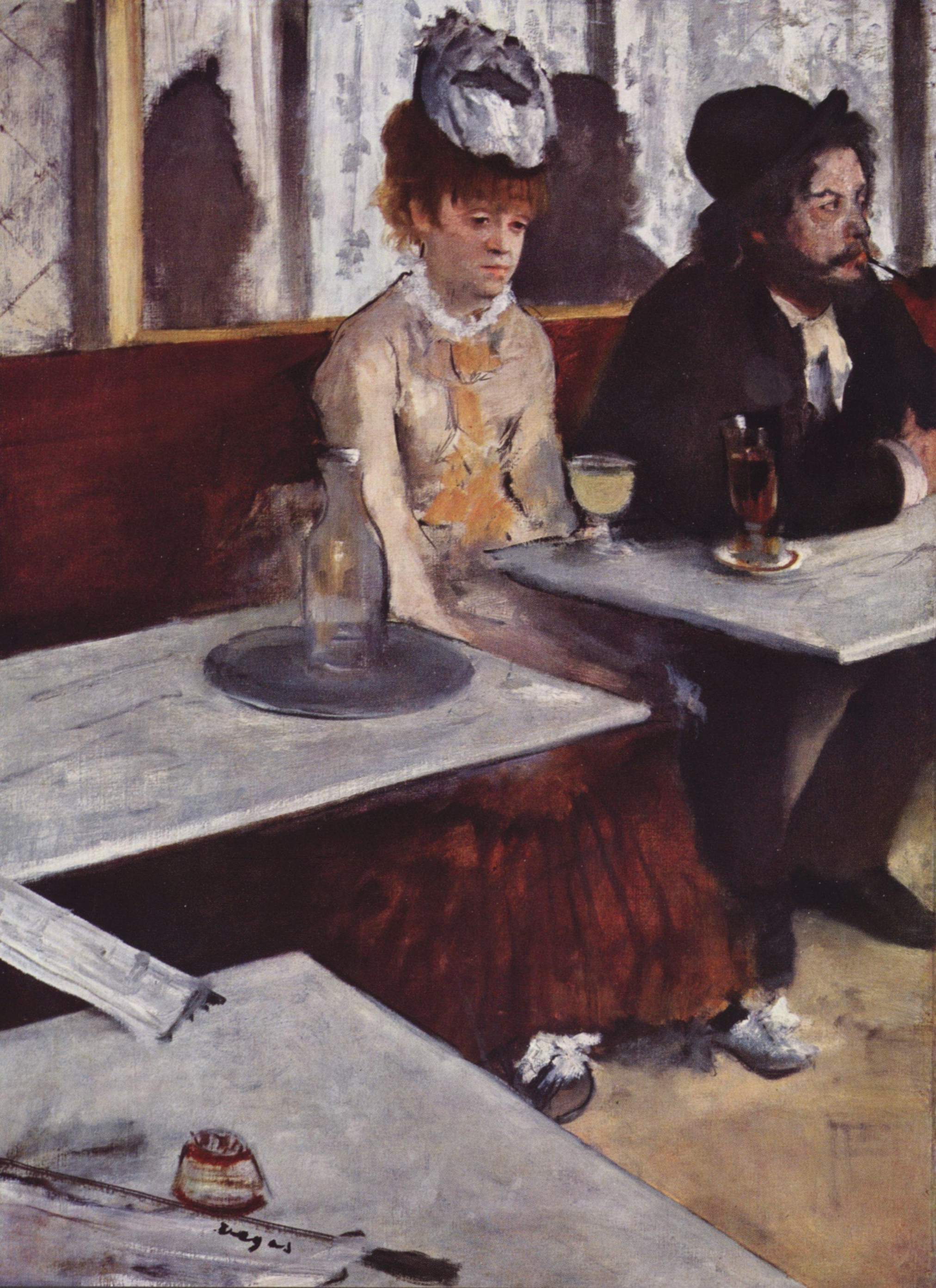
Fort Worth is home to three commendable art museums: the Kimbell, the Modern, and the Amon Carter. A major exhibition of Impressionist paintings from Paris's Orsay Museum is arriving on October 19 at the Kimbell, and will be in place until January 25, 2015: Faces of Impressionism: Portraits from the Musée d'Orsay. It focuses on works by major players in the Impressionist and post-Impressionist movements: Caillebotte, Cézanne, Degas, Monet, Renoir. Since we spend little enough time on portraits in class, this might be a good way to augment your visual repertoire. Alas, it doesn't get here in time for the Formal Analysis assignment, but next quarter's Art History 2 inmates will have a chance to take advantage of it.
The permanent collection at the Kimbell does, however, contain holdings from the Baroque, Rococo, Romantic, Impressionist, and post-Impressionist periods, many of which are currently on exhibit in the new Renzo Piano Pavilion.
The Dallas Museum of Art
Currently on exhibit is a rather wonderful collection called Saturated: Dye-Decorated Cloths from North and West Africa, which might be of interest to fashion folk, and also provide some insight into African influence on modern European art.
As a reward for anyone who actually reads this post, Art History 2 students may select works from Mind's Eye: Masterworks on Paper from David to Cézanne for their formal analysis (elsewhere I've restricted the assignment to paintings rather than drawings or pastels); just make sure any chosen works are in color. It runs until October 26 in the Chilton Gallery.
Those of you who were intrigued by the Käthe Kollwitz print I showed as an introduction to German Expressionism might want to see Käthe Kollwitz: A Social Activist in the Era of World War I. It's up until November 16 on the second level. Since these are monochrome prints and drawings, though, they won't qualify for the analysis essay. They might, however, acquaint you with a wider sense of her work, and would be of particular interest to drawing students and animators.
Coming soon: If you're not completely fed up with still-life painting, you might want to see Bouquets: French Still-Life Painting from Chardin to Matisse, which opens on October 26 and runs through February 8 of 2015. This promises to provide a panorama of still-life works that can demonstrate the enduring impact of the genre.
And finally, arriving on November 15, a collection of works by Jackson Pollock, called Blind Spots will feature his "Black Pourings," painted between 1951and 1953. Unlike the more colorful works we study in class, these are all made with black enamel and oil--and the exhibit will contrast the two periods (including earlier works from 1947-1949). This is an important exhibit because the DMA is the only venue.
Please let me know if you find this new feature helpful, and I'll be happy to keep it up. Happy museum-going!
Image credit: Edgar Degas's L'Absinthe, 1876, will be featured in the Kimbell Faces of Impressionism show. Photo via Wikimedia Commons.
It sometimes amazes me how little time my students spend looking at the real thing--as opposed to digital images projected on a screen. I hope that by alerting you all to current events I can remedy this situation. Most area museums offer free entry to their permanent collections, and often provide free-entrance days or reduced prices to special exhibits for students. Check home pages to find out when.
Most of the offerings listed below are focused on topics covered in Art History 2. But since most of the Art History 1 students will be moving on, it certainly wouldn't hurt to get a heads-up on some of what we'll be discussing next quarter.
The Kimbell Art Museum, Fort Worth
Fort Worth is home to three commendable art museums: the Kimbell, the Modern, and the Amon Carter. A major exhibition of Impressionist paintings from Paris's Orsay Museum is arriving on October 19 at the Kimbell, and will be in place until January 25, 2015: Faces of Impressionism: Portraits from the Musée d'Orsay. It focuses on works by major players in the Impressionist and post-Impressionist movements: Caillebotte, Cézanne, Degas, Monet, Renoir. Since we spend little enough time on portraits in class, this might be a good way to augment your visual repertoire. Alas, it doesn't get here in time for the Formal Analysis assignment, but next quarter's Art History 2 inmates will have a chance to take advantage of it.
The permanent collection at the Kimbell does, however, contain holdings from the Baroque, Rococo, Romantic, Impressionist, and post-Impressionist periods, many of which are currently on exhibit in the new Renzo Piano Pavilion.
The Dallas Museum of Art
Currently on exhibit is a rather wonderful collection called Saturated: Dye-Decorated Cloths from North and West Africa, which might be of interest to fashion folk, and also provide some insight into African influence on modern European art.
As a reward for anyone who actually reads this post, Art History 2 students may select works from Mind's Eye: Masterworks on Paper from David to Cézanne for their formal analysis (elsewhere I've restricted the assignment to paintings rather than drawings or pastels); just make sure any chosen works are in color. It runs until October 26 in the Chilton Gallery.
Those of you who were intrigued by the Käthe Kollwitz print I showed as an introduction to German Expressionism might want to see Käthe Kollwitz: A Social Activist in the Era of World War I. It's up until November 16 on the second level. Since these are monochrome prints and drawings, though, they won't qualify for the analysis essay. They might, however, acquaint you with a wider sense of her work, and would be of particular interest to drawing students and animators.
Coming soon: If you're not completely fed up with still-life painting, you might want to see Bouquets: French Still-Life Painting from Chardin to Matisse, which opens on October 26 and runs through February 8 of 2015. This promises to provide a panorama of still-life works that can demonstrate the enduring impact of the genre.
And finally, arriving on November 15, a collection of works by Jackson Pollock, called Blind Spots will feature his "Black Pourings," painted between 1951and 1953. Unlike the more colorful works we study in class, these are all made with black enamel and oil--and the exhibit will contrast the two periods (including earlier works from 1947-1949). This is an important exhibit because the DMA is the only venue.
Please let me know if you find this new feature helpful, and I'll be happy to keep it up. Happy museum-going!
Image credit: Edgar Degas's L'Absinthe, 1876, will be featured in the Kimbell Faces of Impressionism show. Photo via Wikimedia Commons.
Monday, August 25, 2014
William Morris Strawberry Thief Game
This Just In (and of possible interest to Art History 2 students): Whilst fooling about on the web and checking my blog roll, I found a reference to a new game based, on the well-known-to-my-students Morris textile pattern, developed by a team at the Victoria and Albert Museum in London.
There's a video report from BBC News Scotland, and a report on the process at Sophia George's blog (she's the developer). See also some commentary from The Victorian Librarian (Mid-week Museum: Strawberry Thief by William Morris).
Now what was that again about art history having nothing to do with doing creative work in the real world?
Image credit: William Morris, Strawberry Thief textile design, 1883. Victoria and Albert Museum, via Wikipedia.
Tuesday, July 16, 2013
Pseudoarchaeolgy Rides Again
It seems appropriate to post a new comment on a perennial issue in my classes, since another question about questionable "finds" came up last week.
My problems with what shows up on popular entertainment venues and "news" sources that actively seek out the sensational is that it all gets in the way of rational examination of evidence to help us understand the past. In the previous post on the topic (from last Winter) I addressed giant skeletons and odd places for Minoans to show up. This time it was prompted by a similar story: crystal pyramids in the Bermuda Triangle. I'm afraid I popped of at the poor student who asked it, and for that I apologize deeply. What threw me off my game, however, wasn't the question itself, but the source: Yahoo News. No wonder I have high blood pressure.
So my first recommendation is to take that sucker off your RSS feed. If you're using Yahoo for e-mail (not a good idea; expect to be hacked, repeatedly), ignore the "news." It's directed at the uninitiated, the innocent, and the gullible as far as I can tell. Stick with reputable sources like the major news outlets that get fact-checked (even though it doesn't always seem to work). Unfortunately the priority in many online news sources is entertainment and sensationalism, rather than verifiable facts.
In answer to the question, however, no I hadn't heard about crystal pyramids in the Bermuda Triangle--but then I automatically tune out when anybody mentions "crystal" anything, pyramids (except in Egypt, Nubia, or Mesoamerica), or the so-called "Bermuda Triangle." I can't blame folks less innately skeptical than I for falling for it because of the way "evidence" is provided. But there isn't any, so fuggedaboutit. For a good argument about why, see the U. S. Navy's page on it (after all, military vessels have been implicated as evidence). Other good sources: the National Oceanic and Atmospheric Administration (NOAA) page; Bermuda Triangle: Where Facts Disappear (Live Science); Bermuda Triangle: Behind the Intrigue (National Geographic).
I'm not quite sure where all the interest in "crystal" comes from--aside from the fact that the quartz crystals that most people seem to be talking about (although any mineral that forms crystals gets attention from somebody or other) are both hard (most rocks are) and pretty. I have a nice conglomeration of quartz crystals that decorates a bookshelf and acts as a bookend, which I used to illustrate this post. If you want to see some really cool crystalline formations from a variety of minerals, go to the Perot Museum of Nature and Science downtown.
But pyramids made out of crystal? On the seabed? Not likely. Nevertheless, Yahoo's UK "answers" page (the answers are provided by anybody who replies, and the "best" one is chosen by people who read the site) says "The truth is that there are several crystal like Pyramids on the Sea Bed Floor and many speculations of what they are." In fact, however, there is no evidence of any of this--much less any speculation by anybody who knows what he/she is talking about. (For one thing, scientists talk about the seabed or the ocean floor, but not the Sea Bed Floor!) If you are tempted to think that building anything out of "crystal" would be possible, I advise getting hold of a good book on basic geology, and learning a bit about how these things form. And no, I don't have the time or energy to go into the whole crystal skull thing, either (and, by the way, the latest Indiana Jones movie was the worst of the bunch).
Whenever you come across something that sounds astonishing and about which myriad dubious claims are being made (those that sound a bit too amazing), check out Snopes other skeptically oriented sites. I'd send you to the Skeptic Forum, but they're more snarky than helpful. A better discussion is going on at [Skeptic], where you can learn about the origins of the story. And don't forget to carry your Baloney Detection Kit wherever you go.
Once again, I apologize for my spontaneous and rather impolite (!) response to last week's question. I'll try to behave myself in future.
My problems with what shows up on popular entertainment venues and "news" sources that actively seek out the sensational is that it all gets in the way of rational examination of evidence to help us understand the past. In the previous post on the topic (from last Winter) I addressed giant skeletons and odd places for Minoans to show up. This time it was prompted by a similar story: crystal pyramids in the Bermuda Triangle. I'm afraid I popped of at the poor student who asked it, and for that I apologize deeply. What threw me off my game, however, wasn't the question itself, but the source: Yahoo News. No wonder I have high blood pressure.
So my first recommendation is to take that sucker off your RSS feed. If you're using Yahoo for e-mail (not a good idea; expect to be hacked, repeatedly), ignore the "news." It's directed at the uninitiated, the innocent, and the gullible as far as I can tell. Stick with reputable sources like the major news outlets that get fact-checked (even though it doesn't always seem to work). Unfortunately the priority in many online news sources is entertainment and sensationalism, rather than verifiable facts.
In answer to the question, however, no I hadn't heard about crystal pyramids in the Bermuda Triangle--but then I automatically tune out when anybody mentions "crystal" anything, pyramids (except in Egypt, Nubia, or Mesoamerica), or the so-called "Bermuda Triangle." I can't blame folks less innately skeptical than I for falling for it because of the way "evidence" is provided. But there isn't any, so fuggedaboutit. For a good argument about why, see the U. S. Navy's page on it (after all, military vessels have been implicated as evidence). Other good sources: the National Oceanic and Atmospheric Administration (NOAA) page; Bermuda Triangle: Where Facts Disappear (Live Science); Bermuda Triangle: Behind the Intrigue (National Geographic).
I'm not quite sure where all the interest in "crystal" comes from--aside from the fact that the quartz crystals that most people seem to be talking about (although any mineral that forms crystals gets attention from somebody or other) are both hard (most rocks are) and pretty. I have a nice conglomeration of quartz crystals that decorates a bookshelf and acts as a bookend, which I used to illustrate this post. If you want to see some really cool crystalline formations from a variety of minerals, go to the Perot Museum of Nature and Science downtown.
But pyramids made out of crystal? On the seabed? Not likely. Nevertheless, Yahoo's UK "answers" page (the answers are provided by anybody who replies, and the "best" one is chosen by people who read the site) says "The truth is that there are several crystal like Pyramids on the Sea Bed Floor and many speculations of what they are." In fact, however, there is no evidence of any of this--much less any speculation by anybody who knows what he/she is talking about. (For one thing, scientists talk about the seabed or the ocean floor, but not the Sea Bed Floor!) If you are tempted to think that building anything out of "crystal" would be possible, I advise getting hold of a good book on basic geology, and learning a bit about how these things form. And no, I don't have the time or energy to go into the whole crystal skull thing, either (and, by the way, the latest Indiana Jones movie was the worst of the bunch).
Whenever you come across something that sounds astonishing and about which myriad dubious claims are being made (those that sound a bit too amazing), check out Snopes other skeptically oriented sites. I'd send you to the Skeptic Forum, but they're more snarky than helpful. A better discussion is going on at [Skeptic], where you can learn about the origins of the story. And don't forget to carry your Baloney Detection Kit wherever you go.
Once again, I apologize for my spontaneous and rather impolite (!) response to last week's question. I'll try to behave myself in future.
Thursday, April 18, 2013
From Peplos to Peplum
In response to what I considered a really interesting question in last night's Art History I class, I went into full research throttle and found out some stuff I didn't know--which always gets my little grey cells twitching.
I love it when students connect what they already know from their own fields to what's going on in class, and last night a fashion student asked about the relationship between the Greek peplos (as in the garment worn by the Peplos Kore) with peplum, which I only really knew as a Latinized equivalent of peplos. So this morning I took down my trusty (and dusty) Liddell and Scott Greek dictionary and got the following definitions:
I. Any woven cloth used for a covering, sheet, carpet, curtain, veil, to cover a chariot, funeral urn, seat.
II. Upper garment or mantle in one piece, worn by women. 2. at Athens, the embroidered robe carried in procession at the Panathenaea.
Next came the Cassell's New Latin dictionary, which defined peplum simply as "the robe with which the statue of Athene at Athens was clad at the Panathenaea" and cited Cicero as its source.
Well, we sort of already knew much of the above, so I went on to chase down the evolution of peplum into modern use. My initial Google search turned up an eyeful: all manner of cute little minidresses, apparently quite trendy at the moment, from the Peplum Ponte Tank at Anthropologie, to the Peplum Ponte Dress at Victoria's Secret. What these garments have in common is a flared element over the hips, and it's certainly possible to see how this might have evolved (over two and a half millennia) from a peplos.
From this initial search I moved to the Ultimate Fashion History Source, aka the Metropolitan Museum of Art in New York, where the ever-useful Heilbrunn Timeline of Art History provided a nice thematic essay on the Chiton, Peplos, and Himation in Modern Dress, with examples both ancient and modern. This didn't offer any help on the peplum, however, and I was still wondering about how it made its way into trendiness.
A little further Googling turned up a very nice blog post from Fashion & History (January 2012), which not only explained what's going on at the moment, but also why peplums seemed so familiar to me: The Frilly Tale of the Peplum. It turns out that this particular garment was especially popular in the '40s (so I probably saw my mother in one), and again in the '80s (when I might have missed it during my child-chasing days). The post, by "Author" (who doesn't provide an "about" page, but does cite his/her sources carefully), provides some brief but helpful information (including some vintage Butterick and McCall pattern envelopes featuring peplum dresses from both eras).
For a more traditional source on the origins of the Greek version of the garment, here's the page I mentioned in class, from Cambridge University's Classics faculty, on The Peplos Kore.
If anyone else runs into anything interesting, please send me the information for posting here (or write your own post for inclusion in the Parliament).
Sources not linked above:
Liddell, Henry G. and Robert Scott. A Greek-English Lexicon. 9th Ed. Oxford: Oxford UP, 1985. Print.
Mourning Athena. ca. 460 BCE. Acropolis Museum, Athens. Wikipedia, The Free Encyclopedia. Wikimedia Foundation, Inc. 14 March 2013. Web. 18 April 2013.
Simpson, D. P. Cassell's New Latin Dictionary. New York: Funk and Wagnells, 1960. Print
I love it when students connect what they already know from their own fields to what's going on in class, and last night a fashion student asked about the relationship between the Greek peplos (as in the garment worn by the Peplos Kore) with peplum, which I only really knew as a Latinized equivalent of peplos. So this morning I took down my trusty (and dusty) Liddell and Scott Greek dictionary and got the following definitions:
I. Any woven cloth used for a covering, sheet, carpet, curtain, veil, to cover a chariot, funeral urn, seat.
II. Upper garment or mantle in one piece, worn by women. 2. at Athens, the embroidered robe carried in procession at the Panathenaea.
Next came the Cassell's New Latin dictionary, which defined peplum simply as "the robe with which the statue of Athene at Athens was clad at the Panathenaea" and cited Cicero as its source.
Well, we sort of already knew much of the above, so I went on to chase down the evolution of peplum into modern use. My initial Google search turned up an eyeful: all manner of cute little minidresses, apparently quite trendy at the moment, from the Peplum Ponte Tank at Anthropologie, to the Peplum Ponte Dress at Victoria's Secret. What these garments have in common is a flared element over the hips, and it's certainly possible to see how this might have evolved (over two and a half millennia) from a peplos.
From this initial search I moved to the Ultimate Fashion History Source, aka the Metropolitan Museum of Art in New York, where the ever-useful Heilbrunn Timeline of Art History provided a nice thematic essay on the Chiton, Peplos, and Himation in Modern Dress, with examples both ancient and modern. This didn't offer any help on the peplum, however, and I was still wondering about how it made its way into trendiness.
A little further Googling turned up a very nice blog post from Fashion & History (January 2012), which not only explained what's going on at the moment, but also why peplums seemed so familiar to me: The Frilly Tale of the Peplum. It turns out that this particular garment was especially popular in the '40s (so I probably saw my mother in one), and again in the '80s (when I might have missed it during my child-chasing days). The post, by "Author" (who doesn't provide an "about" page, but does cite his/her sources carefully), provides some brief but helpful information (including some vintage Butterick and McCall pattern envelopes featuring peplum dresses from both eras).
For a more traditional source on the origins of the Greek version of the garment, here's the page I mentioned in class, from Cambridge University's Classics faculty, on The Peplos Kore.
If anyone else runs into anything interesting, please send me the information for posting here (or write your own post for inclusion in the Parliament).
Sources not linked above:
Liddell, Henry G. and Robert Scott. A Greek-English Lexicon. 9th Ed. Oxford: Oxford UP, 1985. Print.
Mourning Athena. ca. 460 BCE. Acropolis Museum, Athens. Wikipedia, The Free Encyclopedia. Wikimedia Foundation, Inc. 14 March 2013. Web. 18 April 2013.
Simpson, D. P. Cassell's New Latin Dictionary. New York: Funk and Wagnells, 1960. Print
Saturday, January 19, 2013
Honing BS Detection Skills
This week's Art History 1 Neolithic to Bronze Age discussion got my dander up a bit because I didn't have ready answers to questions about skeletons of giants and evidence of Minoans in Michigan. But it didn't take long to uncover the sources of the mishegoss, so I thought best to share it on this quarter's first post to the assembled Parliament.
First off, the giant skeleton issue was easy to track down (keywords "giant" and "skeleton") because Snopes had already debunked it and that's the first place I usually look for answers to questions of this nature. Plain and simple, Folks: they're fake. I have several more sources if this doesn't suffice.
The second query was about whether or not archaeologists have found evidence of Minoans in Michigan, where they purportedly went to look for copper and left behind a tablet with writing on it. The BS factor here pops up immediately, too, because one might legitimately wonder how they'd even know there was copper there (even if they had any reason to know where "there" was), and one glimpse of the "tablet" shows that it's not Linear A. But hunt about I did, as promised, and now I'm really glad y'all asked, because I found a terrific blog by one smart dude that I'm going to head for first if this ever happens again.
For a straightforward treatment of this particular bit of silliness, read Jason Colavito's Review of America Unearthed S01E03: "Great Lakes Copper Heist." Not only does he clear things up elegantly, but he also solved the mystery of where you folks got the idea in the first place. So my next piece of advice is this: stay away from edutainment shows like America Unearthed or Secrets of the Dead (my comment on their Minoan/Atlantis episode is still on their website).
And just to show you that I'm not blowing smoke about how important garbage is to interpreting prehistory, I again defer to Mr. Colavito: Alternative Archaeology: Where's the Trash?
Homework assignment: download a copy of Carl Sagan's Baloney Detection Kit and carry it with you at all times. I know this is not your fault; most of you were educated in Texas, and I'll do what I can to make up for it.
Image credit: A bit of the "Marine Fresco" from Akrotiri (can you just imagine the Minoans heading to Michigan, out through the Gates of Herakles and across the Atlantic in these boats?). Via Wikimedia Commons.
First off, the giant skeleton issue was easy to track down (keywords "giant" and "skeleton") because Snopes had already debunked it and that's the first place I usually look for answers to questions of this nature. Plain and simple, Folks: they're fake. I have several more sources if this doesn't suffice.
The second query was about whether or not archaeologists have found evidence of Minoans in Michigan, where they purportedly went to look for copper and left behind a tablet with writing on it. The BS factor here pops up immediately, too, because one might legitimately wonder how they'd even know there was copper there (even if they had any reason to know where "there" was), and one glimpse of the "tablet" shows that it's not Linear A. But hunt about I did, as promised, and now I'm really glad y'all asked, because I found a terrific blog by one smart dude that I'm going to head for first if this ever happens again.
For a straightforward treatment of this particular bit of silliness, read Jason Colavito's Review of America Unearthed S01E03: "Great Lakes Copper Heist." Not only does he clear things up elegantly, but he also solved the mystery of where you folks got the idea in the first place. So my next piece of advice is this: stay away from edutainment shows like America Unearthed or Secrets of the Dead (my comment on their Minoan/Atlantis episode is still on their website).
And just to show you that I'm not blowing smoke about how important garbage is to interpreting prehistory, I again defer to Mr. Colavito: Alternative Archaeology: Where's the Trash?
Homework assignment: download a copy of Carl Sagan's Baloney Detection Kit and carry it with you at all times. I know this is not your fault; most of you were educated in Texas, and I'll do what I can to make up for it.
Image credit: A bit of the "Marine Fresco" from Akrotiri (can you just imagine the Minoans heading to Michigan, out through the Gates of Herakles and across the Atlantic in these boats?). Via Wikimedia Commons.
Monday, October 17, 2011
Caravaggio at the Kimbell
Art History 2/History of Art & Design II students might be interested in the Kimbell Art Museum's new blockbuster show, Caravaggio and His Followers in Rome, which started yesterday.Caravaggio was an absolute master at manipulating light and shadow, as well as creating the most dramatic of all possible interpretations of any biblical passage that inspired him--such as the Sacrifice of Isaac, above (1594-96), now usually housed in Florence's Uffizi Gallery.
For a review of the exhibition, see Scott Cantrell's article in the Dallas Morning News from last Sunday.
The upcoming formal analysis essay assignment provides as good an excuse as any to head to Fort Worth for this chance to see Caravaggio's work, and that of his contemporaries. His enormous influence is well represented in this show.
Monday, October 3, 2011
Paleolithic Children's Art
On my way home from work during the break, I heard about this cave, and these "finger flutings" on PRI's The World. Marco Werman interviewed an archaeologist (Jessica Cooney) who's been working in the "Cave of the Hundred Mammoths" in Rouffignac, Dordogne region, France--in the same general area as Lascaux Cave.
One of the things old folks like me actually enjoy is learning stuff we don't already know--and this was certainly a new one on me! I had never heard of Rouffignac, let alone the Mammoth drawings--nor anything called finger flutings (trailing fingers in damp clay to make designs).
I'll be bringing this up in the Art & Design I and Art History I classes this week, but thought some of you who are already beyond these classes might also enjoy learning something new.
Labels:
art,
cave painting,
children and art,
finger fluting,
Paleolithic
Sunday, September 11, 2011
Illumination and Mythography
Former student and app-designer extraordinaire, Alex Antonio, sent this link--having remembered, no doubt, what fun he had illuminating a manuscript for me: Art Student Hand-Illuminates, Binds a Copy of Tolkien’s Silmarillion. I'm not posting an image for copyright reasons, but the link takes you to the article. Make is a terrific magazine (in print or digital form), anyway--well worth noting for many reasons. I'm always happy to plug stuff I love to read.
Thursday, August 18, 2011
Drawing Lessons
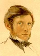
The first installment, "Getting Back to the Phantom Skill" (September 10, 2010) discusses why he embarked on the twelve-part series, and introduces his plan. Scattered throughout the columns are examples from art history that show how skills develop and how artists have used them in the past. The series ended last December with "The Road to the Ten Unknowns," about McMullan's creation of a theater poster.
The Ashmolean Museum houses his teaching collection, and has a website devoted to The Elements of Drawing. The materials are vast (they include a video drawing lesson based on Ruskin's principles) and of interest to anybody who wants to learn to draw--or to draw better.
The book costs less than $10 in paperback; the only thing cheaper and that good is the McMullan series.
Image notes: The painting is John Ruskin in His Study at Brantwood, by William Collingwood (1881); the self portrait is watercolor touched with bodycolour over pencil, 1861. Both from Wikimedia Commons.
Monday, August 15, 2011
Endangered Alphabets
As many of you already know, I'm a lover of the word. Words, books, alphabets, languages--all aspects of reading and writing as a human cultural/technological activity fall under my owlish gaze.
So when I saw a review of Tim Brookes's Endangered Alphabets project, I was immediately intrigued, and got on board (a really awful pun, if you think about it).
Lovers of type and typography would do well to take a look at this, and contribute if you have any spare cash on hand. I've ordered the book and will share it with everyone when it comes.
So when I saw a review of Tim Brookes's Endangered Alphabets project, I was immediately intrigued, and got on board (a really awful pun, if you think about it).
Lovers of type and typography would do well to take a look at this, and contribute if you have any spare cash on hand. I've ordered the book and will share it with everyone when it comes.
Sunday, August 7, 2011
News, Newsreels, and Uncle News
For no particular reason, other than the fact that I'd been going through old photographs yesterday, it occurred to me to do a bit of research on an old family friend, Newsreel Wong.
Wong made a name for himself in the late '30s for a photograph he took (and possibly staged to some extent) of a baby on a Shanghai train platform.
What I didn't know was that he had been in New York City on July 28, 1945, when a disoriented pilot flew his Boeing B-25 Mitchell Bomber into the Empire State Building. Visiting the Hearst Metrotone offices early that morning, Newsreel Wong had been the only one in an office when the phone rang, and he answered it. He ended up commandeering a camera and headed to the site, where he was able not only to shoot the exterior of the building but got in to get film of the offices that were affected. The only other person who managed to gain access was Max Markman, who posed as a doctor, and shot the footage of the event included in this British Pathé newsreel.
A less sensationalized version of the coverage can also be found on YouTube, but I thought this highly edited bit was interesting for its embellishments. Since I'll be teaching the Visual Anthropology course in the Fall, this could provide some talking points about the role of the observer in the interpretation of events, and the impact editing has on the reception of information.
I don't know what happened to Wong's footage, but locating this particular event during an innocent search for a character from my past (he was known to my brother and me as "Uncle News" and lived near us on Yang Ming Shan outside of Taipei) amounts to a bit of the kind of synchronicity we've been talking about in the Myth class. As the tenth anniversary of 9/11 nears, this incident resonates eerily with more recent events.
One of the best blogs about media history I've ever found on the web is Amanda Emily's Feeding the News Beast: A Century of Tales from Behind the Lens. Her post on this event is the source of much of my information, and one on Wong himself explains how he got his nickname. Digital Video and Photography students ought to bookmark her site, because it's an endlessly informative record of visual news coverage.
Note: I'm posting this entry on both the Cabinet and The Owls' Parliament, due to its potential interest for a variety of audiences.
Wong made a name for himself in the late '30s for a photograph he took (and possibly staged to some extent) of a baby on a Shanghai train platform.
What I didn't know was that he had been in New York City on July 28, 1945, when a disoriented pilot flew his Boeing B-25 Mitchell Bomber into the Empire State Building. Visiting the Hearst Metrotone offices early that morning, Newsreel Wong had been the only one in an office when the phone rang, and he answered it. He ended up commandeering a camera and headed to the site, where he was able not only to shoot the exterior of the building but got in to get film of the offices that were affected. The only other person who managed to gain access was Max Markman, who posed as a doctor, and shot the footage of the event included in this British Pathé newsreel.
A less sensationalized version of the coverage can also be found on YouTube, but I thought this highly edited bit was interesting for its embellishments. Since I'll be teaching the Visual Anthropology course in the Fall, this could provide some talking points about the role of the observer in the interpretation of events, and the impact editing has on the reception of information.
I don't know what happened to Wong's footage, but locating this particular event during an innocent search for a character from my past (he was known to my brother and me as "Uncle News" and lived near us on Yang Ming Shan outside of Taipei) amounts to a bit of the kind of synchronicity we've been talking about in the Myth class. As the tenth anniversary of 9/11 nears, this incident resonates eerily with more recent events.
One of the best blogs about media history I've ever found on the web is Amanda Emily's Feeding the News Beast: A Century of Tales from Behind the Lens. Her post on this event is the source of much of my information, and one on Wong himself explains how he got his nickname. Digital Video and Photography students ought to bookmark her site, because it's an endlessly informative record of visual news coverage.
Note: I'm posting this entry on both the Cabinet and The Owls' Parliament, due to its potential interest for a variety of audiences.
Labels:
Amanda Emily,
news media,
Newsreel Wong,
newsreels,
photography,
war coverage
Saturday, August 6, 2011
Tidying Up Art
In this week's History of Art & Design II class, I mentioned Ursus Wehrli's book, Tidying Up Art as a commercial example of parody. One of my students (sorry; can't remember who) said that he'd seen a TED talk by Wehrli, so I looked it up, and here it is.
Just in case you have a few minutes to spare, or need a break from studying for midterms.
Thursday, July 21, 2011
Design and Stuff
For my first Summer quarter post, I was inspired by an article in Good about whether or not it's possible for designers to save the world without creating more stuff. Material objects are, after all, the focus of our design programs at AiDallas. What would to design mean if we weren't focused on creating objects?One of the major revelations to come out of my first week of classes (and I don't know why this hadn't occurred to me before) was that in the ancient world, people made things carefully because they couldn't just go down to their local Buy More and get a replacement when something broke. There probably wasn't much garbage to pick up, because early economies weren't based on disposable objects. Everything was designed with its purpose in mind, and the designs (as we learn from Uhlmeyer's Rule of Technological Development #312) endured when technologies changed. That's why the early ceramic jugs in neolithic Turkey looked just like the baskets they had replaced as water carriers.
In our art & design history discussions during these first two weeks of classes, we've talked about the notion of "art for art's sake"--the nineteenth-century idea that "fine" art was qualitatively better than "applied" art because it was made for no purpose other than its beauty. But the Greeks and Romans made beautiful things that all had uses: funerary or heroic statues, painted pottery for drinking wine, temples for worshiping gods, etc. The words they used for art (techne and ars) both contained the idea that the objects be well-crafted, skillfully wrought.
Archaeologists love ancient dumps (middens) because they contain clues about the people who occupied the sites under study. But those dumps rarely contain objects discarded whole--only broken bits of things. Acoma Pueblo native Americans actually gather old potsherds to add to new pots made using traditional techniques, wasting nothing. In fact, the reason Indiana Jones isn't a believable archaeologist is that he just takes whole objects out of context--something no reputable scientist would ever do. The real guys in the safari hats get their kicks out of finding bits and pieces that can be put back together to give us an idea about what they originally looked like and what they were used for. Just about the only time we find collections of intact artifacts is when they've been buried by some disaster, like the eruptions of Mt. Vesuvius or Thera.
I hadn't realized before this week that the archaeology exercise my humanities students do (figuring out what random objects in a box might "mean") is more realistic than I'd imagined, because the stuff in the boxes is all twenty-first century junk: miscellaneous bits of useless crap randomly put together, just like what future archaeologists are going to find in our landfills. Cheesy little toys from Happy Meals, broken crayons, miscellaneous buttons, and junky jewelry are going to tell our story more potently than a museum full of art works.
In the opening photograph, all of the items pictured could be recycled; instead some idiot (or idiots) left them in a pine forest somewhere. The plastics will be there just about forever--and somebody designed every one of these objects.
So here's the question: how do fashion, interior, web, graphic, and other designers create without just adding more junk to the growing mounds of waste on this planet?
Image credit: Photo by Michelangelo-36, via Wikimedia Commons.
Tuesday, June 7, 2011
Spring Quarter Miscellany
Due to major lack of interest on my students' part, as well as lack of time on my own, I've neglected the Parliament for the entire quarter. Sudden needs for bonus points have emerged, however, and so to accommodate those who've been suddenly inspired to enhance their final grades, I'm offering up a couple of newsy bits that might be useful to some of you.
An old friend of my art and design history and humanities courses, Maggie Macnab (Macnab Design) recently presented a TEDx talk in Albuquerque, called "The Nature of Symbols." This should be interesting to anyone involved in design, advertising, branding, and any number of artistic pursuits.
I've frequently recommended Macnab's book, Decoding Design, to instructors and students alike, and her newest effort, Design By Nature, will be published later this year.
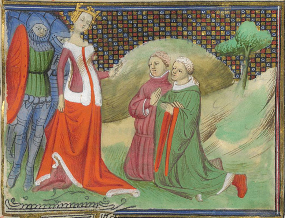
Here's one that goes to show you that taking art history classes might not be a complete waste of time. The Morgan Library & Museum in New York has launched an exhibit called Illuminating Fashion: Dress in the Art of Medieval France and the Netherlands, and the New York Times review of the show includes a nifty slide show with images from the featured manuscripts. Karen Rosenberg, who wrote the review notes that it "will teach you to scrutinize centuries-old manuscripts as you would a style magazine." For fashion history students, this approach seems made in heaven; not only can you find out what people wore when, but you might also be struck with inspiration for new and unusual designs based on centuries-old models. Aspiring rock singers could out-gaga Lady Gaga with information like this!
For further inspiration, try perusing the manuscript illumination images on Wikimedia Commons, where I found the image of Queen Isabelle of France at left. It's a 15th century painting by a guy known as "the Boethius Master" for the Froissart Chronicles.
This will undoubtedly be my last (as well as first) post for the quarter, so I hope everyone has a splendid summer vacation. I think we all deserve a bit of time off after having slogged through 22 weeks with only a seven-day break in the middle, and a couple of holidays that may have done more harm than good. Be careful out there!
An old friend of my art and design history and humanities courses, Maggie Macnab (Macnab Design) recently presented a TEDx talk in Albuquerque, called "The Nature of Symbols." This should be interesting to anyone involved in design, advertising, branding, and any number of artistic pursuits.
I've frequently recommended Macnab's book, Decoding Design, to instructors and students alike, and her newest effort, Design By Nature, will be published later this year.
Here's one that goes to show you that taking art history classes might not be a complete waste of time. The Morgan Library & Museum in New York has launched an exhibit called Illuminating Fashion: Dress in the Art of Medieval France and the Netherlands, and the New York Times review of the show includes a nifty slide show with images from the featured manuscripts. Karen Rosenberg, who wrote the review notes that it "will teach you to scrutinize centuries-old manuscripts as you would a style magazine." For fashion history students, this approach seems made in heaven; not only can you find out what people wore when, but you might also be struck with inspiration for new and unusual designs based on centuries-old models. Aspiring rock singers could out-gaga Lady Gaga with information like this!
This will undoubtedly be my last (as well as first) post for the quarter, so I hope everyone has a splendid summer vacation. I think we all deserve a bit of time off after having slogged through 22 weeks with only a seven-day break in the middle, and a couple of holidays that may have done more harm than good. Be careful out there!
Sunday, April 17, 2011
This Just In
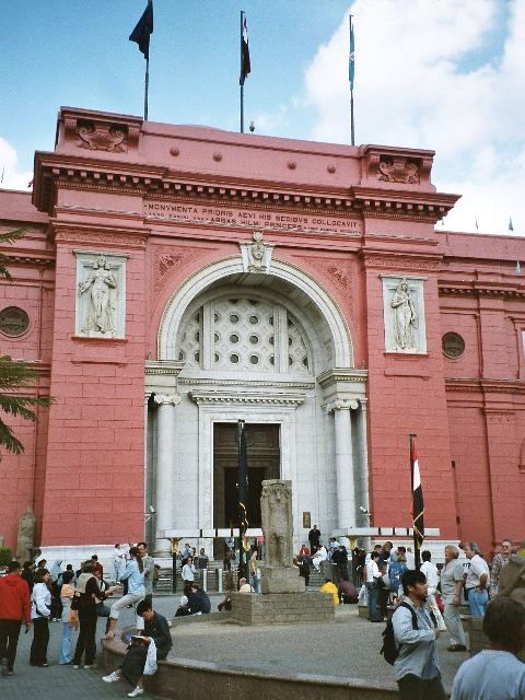
Rather, significant looting seems to have taken place, not only at the museum itself, but in storehouses elsewhere. The editorial by the president of the Archaeological Institute of America in this month's issue of Archaeology includes a plea for public support in helping to recover lost items. The heretofore indomitable Zahi Hawass has resigned in protest over the incidents.
Some of the objects seem to have been returned, as reported by the Huffington Post and other sources, so perhaps the publicity is doing some good. The article also refers to Hawass as having been re-appointed.
By all means visit the Archaeology website, especially if you're enrolled in my Humanities class this quarter, and check out the piece on Diving Ice Age Mexico. We'll be talking about the Maya later in the quarter, and this article contains some interesting material.
Labels:
archaeology,
Archaeology Magazine,
Egyptian Museum,
looting,
Zahi Hawass
Wednesday, March 9, 2011
Geometry, Art, Pi, and Pie
Now that the faithful are hung over from Mardi Gras, and walking around with ashes on their foreheads, I thought I might introduce another holiday that won't require breaking any Lenten Fasts: Pi day, March 14 (3.14). Here's hoping you haven't given up pie for Lent.I'm fond of pimping general studies classes of any variety, not just my own, so I pay attention to my monthly newsletters from the Annenberg folks (the ones who bring us Invitation to World Literature and Art Through Time). They have a nifty website on math in the real world: Math in Daily Life, with interactive pages designed for school-age kids. Let's face it, though; most of us have forgotten what we learned about math anyway--even if you managed to squeak through College Algebra or Creative Geometry just last quarter. If you're unclear on the notion of pi, check out the page on that. There's even a segment on math and interior decorating and another on cooking.
If you think math is essentially irrelevant to artists, consider the importance of geometry in art and architecture, explored in this unit from a course on the topic at Dartmouth: The Circle, The Wheel of Fortune, and the Rose Window. The image that opens this post is the south transept Rose Window from St. Denis (via Wikimedia Commons). Some of you may remember (depending on how you spent Fat Tuesday) that we've recently visited St. Denis in History of Art & Design I.
Google even gets in on the fun (this is from last year):

If you still don't believe me, and won't until you see actual proof that such a holiday exists, there is also a Wikipedia page.
I especially love this tee-shirt I pinched from Wikimedia Commons; you can find it and other appropriate festive attire at Thinkgeek.com.
Unfortunately, Pi Day falls on a Monday this year (I'm not on campus Mondays), so I won't be bringing pie to class. You'll have to wait for cookies on finals day.
Tuesday, March 1, 2011
TED 2011: The Rediscovery of Wonder
Time to check in on TED to see what's coming up at the annual conference that started yesterday. The focus this year is on wonder, which--as anybody who's ever sat in any of my classes for more than five minutes knows--is the beginning of philosophy. But it's also the beginning of creativity, because curiosity is one of the primary characteristics of creative people. The blurb on the site offers a preview:For 2011, we are assembling a cast of characters capable of stirring the imagination as never before. Explorers, storytellers, photographers, scientific pioneers, visionaries and provocateurs from all parts of the globe. And we won’t be forgetting the other, harder-edged meaning of wonder -- where “I wonder” equals “I ponder.” We’ll be adding in strong servings of thoughtful insight, so that the possibilities we dream of are anchored in reality.
Not many of us have the 500 smackeroos it costs to "attend" the conference online, but a peek at the schedule will give you an idea of what we can look forward to over the next couple of years, since the annual conferences are where the posted videos come from.
The talks are arranged by sub-topic ("Worlds Imagined," "Beauty, Imagination, Enchantment," "If Only, If Only"), and include speakers who're identified (among many others) as physicists, artists, filmmakers, photographers, bone diggers, and (my favorite) a "wrongologist."
Kathryn Shulz, author of Being Wrong: Adventures in the Margin of Error (she has blog, too: The Wrong Stuff), will be one of the speakers. As will Bill Gates, Julie Taymor, film critic Roger Ebert, New York Times columnist David Brooks, and singer Bobby McFerrin.
Shulz is particularly interesting to me because I'm a faithful practitioner of the art of being wrong. I absolutely love it when I get it wrong. Maybe not so much as when I occasionally get things spot on, but I've always preached that one should embrace the process rather than the product. Being wrong leads us toward getting it right in the end, and stirs up our creative juices like like a shot of jalapeno juice in a fruit smoothie.
Not that simply trying is enough. I certainly don't fall into the "it's the effort that counts" camp. Rather, being wrong means you've not only tried, but that you've gotten somewhere. Maybe not where you wanted to get--but to a place from where you can begin to map out a new path. The first solution isn't always the best, but you learn from doing the work to get to it. That's why I like to call projects for my classes "problems," because all the possibilities aren't always apparent when you start, and there is seldom only one solution that works.
May I take this opportunity to request, however, that when you embark on said projects, that you take the time to read the instructions carefully, and design a plan of attack. That way, you can direct your energy toward potentially fruitful outcomes. Even if your plans don't work out exactly as you expect them to, you may be pleasantly surprised in the end. Not only that, but you'll have something suitable to turn in week 10.
Image credit: I hope this is legal. I pinched it from the "photos" section of the TED site. It depicts some of the featured speakers.
Thursday, February 17, 2011
Here's Your Chance to Have a Say
The Daily Good for February 15 (otherwise known as Half Price Chocolate Day) offers students the opportunity to speak up on the future of education: Hey, Young People: Arne Duncan Wants to Answer Your Education Questions.
For those of you who don't already know this, Arne Duncan is the U. S. Secretary of Education. And since you folks are the ones to suffer and/or benefit from changes currently being discussed and implemented, it might be a good idea for you to weigh in. It's mostly about K12, rather than higher education, but most of you aren't that far removed from those glory days--and some of you will be having children that will be affected by policies developed over the next few years.
I also wanted to alert you to the video I've been showing in some classes this week, given by Sir Ken Robinson and animated by RSAnimation: Changing Education Paradigms. The link will take you to other Robinson videos and others by RSAnimation--and/or go there to see a larger screen; I had to reduce this one to fit my snazzy new blog design.
For those of you who don't already know this, Arne Duncan is the U. S. Secretary of Education. And since you folks are the ones to suffer and/or benefit from changes currently being discussed and implemented, it might be a good idea for you to weigh in. It's mostly about K12, rather than higher education, but most of you aren't that far removed from those glory days--and some of you will be having children that will be affected by policies developed over the next few years.
I also wanted to alert you to the video I've been showing in some classes this week, given by Sir Ken Robinson and animated by RSAnimation: Changing Education Paradigms. The link will take you to other Robinson videos and others by RSAnimation--and/or go there to see a larger screen; I had to reduce this one to fit my snazzy new blog design.
Wednesday, February 9, 2011
Design Web News
Yet another snow day has found me on the web, and fooling around with blog design. The initial "Watermark" template was only meant to be temporary, but I haven't until today had time to sit down and work on changing it. I'd appreciate some feedback, since this will always be a work in progress. If you think it needs more tweaking, let me know, and we can work on it together.While I was messing about in my e-mail this morning, I found some stuff you folks might find interesting. The first item came to me via Good magazine, which featured an article on a blog called 10Answers, founded by Rebecca Silver who writes and designs in (where else?) New York City. The concept is simple. Every post consists of a series of ten questions Silver asks of fellow creative people, such as yesterday's interview with graffiti artist/muralist Caleb Neelon. Categories include almost every kind of art and/or design, so there's something here for everyone. I'm thinking of adapting her format for my student information sheets--since the answers are much more interesting than what I usually ask for.
From the venerable New York Times section on the Arts came a short article on an exhibit at Milan's La Triennale Design Museum, Celebrating a Graphic World. Oddly enough, there are more images available on my iPad version of the Times online--but the primary interest of the article lies in its discussion of changes in how we view the field of graphic design and its relationship to advertising.
And just in case you haven't heard about this yet, Google's latest wizardry involves applying its street-view technology to museums. Go to the Google Art Project to visit some important museums around the world, and use its features to explore significant works of art really close-up. Ever wanted to put your nose right up to Van Gogh's Starry Night? You can do it here--just go to the Museum of Modern Art (MoMA) in New York, and zoom in.
As usual, I leaped over to Wikimedia Commons when I was looking for an image to illustrate this post. I wanted to see if there was anything available that had at least something to do with graphic design (since all of the stuff related the articles I mentioned is copyrighted). With my usual serendipitous luck, I found a work by the British poster artist, Tom Eckersley which reminded me of the snow outside my window, of the Pont du Garde aqueduct in Nimes, France (featured in this week's History of Art & Design I lecture), and Henri Matisse's cut paper works. You can see an online collection from his long career at the Visual Arts Data Service.
And if all the above isn't enough to keep you from getting bored (if, of course you're already finished with whatever I've assigned for the week), take a look at this site full of Free Images from generous folk who, like those who contribute to Wikimedia Commons, don't mind not making a buck off of everything they do.
Subscribe to:
Posts (Atom)